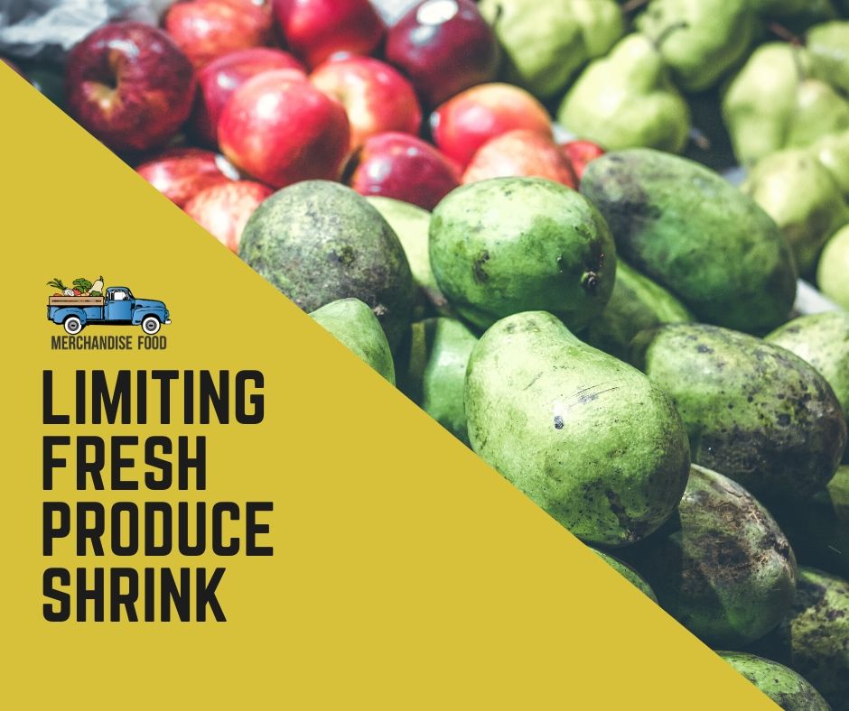
I was meeting the Development Director for Tall Oaks Christian School near Wilmington Delaware yesterday and Harold suggested we meet at a specialty food location right up my alley.  He said Jannsen's Market was the place to go.  Friendly Paula Jannsen took a moment to shake my hand and say hello.  I took a few pictures to share some of my favorite highlight of the trip below.  Right outside the main entrance were some exceptional stained wood display racks for potted and hanging floral offerings.

Nicely hand-trimmed and stacked produce.

The ABC's of Food Retaining: ALWAYS BE CATERING.

The base of this display featured a current trend in food presentation: Plating Foods & Appetizers on Salt Blocks

I think the Jannsens had more Godiva Chocolates for sale than Godiva's branded mall locations. (:

Well designed Eggplant Parm presentation interesting plates.


I've always been a fan of the relaxing retail environment at The Fresh Market and drove out of my way from Delaware to see any new ideas.  The ambiance of the store is accented with classical music for a slow paced stroll through the store.  Probably 1/4 of the retail space is filled with high quality well-merchandised fresh produce, in a Whole Foods like manner, many items stacked on horizontal crate like tables.  I noticed at least two employees working and manicuring the department to maintain the "cared-for" look.  Displays were logical and offered great cross merchandising ideas.  I felt a great effort was made to place key items in metal ice bins throughout the department to maintain freshness and pull in cross-selling opportunities.  Here's some photos from my trip.

In-store cut fruit program with branded packaging was well presented.

Tray wrapped fresh-cut veg convenience offerings were available.


Last Fathers Day my family took me for a meal at the regionally reknowned Terrain Cafe at Styers in Glens Mills, PA. If you've never been, imagine Williams and Sonoma meets your favorite local family owned outdoor gardening center or greenhouse.  The primitive but very intentional merchandising throughout greenhouses, wandering pathways, small sheds was as interesting as it's brick an mortar counterparts owned by the parent company URBN operators of Urban Outfitters and Anthropologie.  I enjoyed a local beer tasting, a summer infused culinary salsa, and honestly couldn't wait to visit again.  Yesterday I stopped by to snap a few photos of the trip and wanted to share a few great display ideas for specialty foods.

Crated Local Farmstead Cheeses on living grass.

Culinary Books featuring Food Images create a bi-purposed backdrop and saleable product offering.

High-End Product offerings by Counter Culture Coffee are sold retail and by the drink on the espresso bar at the entrance to the cafe dining room (greenhouse).

Strong cross selling of catering services are shown on a miniature easel with potted small fern-like plants below.  This subtle message sells the entire ideology and many services of the business in one small on-counter display.

These metal baskets were hung from the cafe counter to display artisan potato chips for easy grab and go items.

The Cafe counter-top with freshly prepared baked goods.

Culinary Papers are great culinary gift item and fill the space with color and edible ideas.


I just had a great conversation with Tony Kadysewski author of  www.fixturescloseup.com blog.  He has spent over 4 years documenting retail fixtures of all types and building a blog to share great ideas and uses of these tools. After reviewing his site today I wanted to share this idea below for a local farm stand display for Heirloom Edibles.  This display has a unique look, and is draws attention just in design...let alone filled with high-impact fresh vegetables.  
Incorporating other antique looking elements into displays at artisan locally sourced food or natural food stores or simply offering retail products with an old fashioned look can be interesting and help communicate a message to your guests.  I recommend Baker Creek Seeds for their packaging and point of sale display fixtures which take you back in time.  
Incorporating food products with black and white labels, clear glass or mason jars, can be interesting as well.  These products can resonate with the intended audience.  I have seen this product at a number of specialty foods stores. This product shows the actual food well and highlights the various colors in the product (garlic, peppers, etc.)
Selecting the right mix of products, fixtures, and props in a locally focused food store can help bring the project together and create an environment with a consistent story and purpose.  I recommend visiting Terrain a concept owned by Urban Outfitters / Anthropologie to capture some of these ideas in action.
 
 
As artisan food producers, I’m certain many of you consider your specialties an extension of who you are and summary of your passions, skills, and experiences.  A little of you is in every morsel, and perhaps some of you is sitting on the bottom of the back shelf, outdated, at your local gourmet retailer.

For many of you, you’ve elected to out-source the retail merchandising responsibility of the end sale.  As I’ve traveled the United States consulting food companies on how to present their products, I’ve recognized the symbiosis of the system.  Producers rely upon retailers to professionally merchandise their offerings, and retailers expect information, point of sale support, and display ideas. 

Visual Food Merchandising includes proper fixtures, color contrast, sounds, lighting, uniforms, signage, service, and creative display development.  Now let’s be real. Despite great products developed through culinary passion, exemplary packaging, and your world-class customer service, your product can end on a hideous display.  Does this represent who you are?

Successful merchandising seeks to affectively and favorably present high-end food products in a manner and service level the end customer finds compelling and hopefully worth paying for again and again. Ideally, retailers will be presenting your products, in the lead display, with no product damage, great lighting, no out-of-date products, and a demo sampling station with a wonderfully cheerful beautiful employee sharing your story with every guest.   Consider how you can impact this process to improve your sales and retail visual image.

Successful producers recognize how discounts, value-added service, educational, and point of sale support position retailers to succeed. On the other hand world class merchandisers can make even a mediocre product look great.  Let me challenge you this season, to consider the following strategies to improve how your product is presented to the retail customer this upcoming year.

  1. Expert Advice: Discuss your goals and successes from your highest volume, best merchandising retail partners.  Consider working with a consultant or friend that has a knack for great display.
  2. Review your Budget: What investment can you make this upcoming year to “invest” in building your sales program to support retailers.
  3. Point of Sale: What fixtures are you using to they technically show 80% product and 20% or less fixture?  Consider having a customer built/designed fixture to supply your retailers, so it’s more difficult to display your product incorrectly.
  4. Customer Review: If you find a certain retailer is constantly making your product look bad, outdated, damaged, etc. strongly consider whether they are worth supplying.
  5.  Display Ideas: Don’t leave your merchandising to chance.  Build 2-4 simple and impactful display ideas, photograph, and supply the retailer with your unique story, and encourage them to share.
  6. Recipe Cards:  Build sales support documents featuring your pride and joy. 
  7. Signage:  Supply your retailer with a simple signage package.  Feature only 2 unique selling points, such as featuring heirloom tomatoes from Genesee County.  It’s not a novel.
  8. Complimentary Products:  Suggest to your retailer items and store that your product might pair well with.
  9. Call them:  Work with your distributor or personally contact your retailers to discuss their plans for your products this season.  Share with them ideas that have worked well, and encourage them to prioritize a prime location.
  10. Commitment: Develop a level of trust and expectations with your retailer.  Go there and build the relationship offer to help set the display, sign, etc. yourself.  Develop the clear expectation that if you’re going to support the retailer, you’re going to expect their commitment to keep displays filled, signage up, and a familiarity with your company’s unique story to help sell the customer.
 
 
For a simple way to gain new food presentation ideas I highly recommend an account on Pinterest.  Frankly, everyone else does the work for you, gathering creative photos showing ways to plate, decorate, cook, or present exciting culinary dishes, snacks, or baked goods.  If I owned a bakery, I could probably make a million dollars just copying unique concepts people post.  In this spirit I'd like to share  a few great examples of folks going well beyond the norm to show food in it's best most alluring light.
Pinterest allows users to organize photos visually into various categories. As you'll see above I have segmented found photos into: Food Merchandising, Plating, Style, Feasts & Fetes, Culinary Action & Sizzle & Garnishing Ideas.
This allows me to easily reference an idea or to find some inspiration.  Below are 10 Top Ideas I've found recently that embody innovation and uniqueness.

1. The extra touch visually and literally sweetens the menu.  Note the untraditional glassware for milk!

2. Extravagant Garnishes in Cocktails Drive the Visual and Sensory Experience.

3. Props made from Food to "Tell the Story" and build fun interactive dining experiences.

4. Creating "How-To-Bake/Make/Cook" Info/ Photo-graphics to demonstrate a concept.

5. Floral Cubes: Edible Flowers encased in Ice as seen on Martha Stewart


Web designers don’t use photos just for the sake of having photos. They serve an important function in directing the viewer’s gaze around your site and ultimately lead them to your call to action; in the end, the most important aspect of your efforts is getting them to input credit card information and then come back for more.
As a food business, you can do this with the right placement of photos. 
As a food business, you can do this with the right placement of photos. According to Business.com, “Breaking up the design with terrific photos or graphics helps your visitors catch their breath occasionally as they take in the content.” Making sure your photos are placed properly can have a significant impact on your site’s conversion rate.

The Science of Web Design

Eye tracking research has found that people view websites in the same way – in the shape of an F down the page. The top left corner gets the most attention. The gaze then moves parallel to the right (reading the navigation bar or headline), then it returns to the left to scan down, with a second parallel move to the right partway down the page.

Viewers spend approximately 69% of their time on the left half of the page, and only 30% on the right half.  Based on this knowledge, there are several conclusions to draw in how you design your site:

·         Photos or no photos, it’s imperative that you keep to convention when designing your layout. Place your main content – especially your call-to-action – on the left side, between one-third and halfway across the page. Reserve the right-hand side of the page for secondary content.

Image Placement

Is your image the most important element on your page? No. Your call-to-action is. The photos you use need to help direct the viewer to your CTA so that they can make a purchase, fill out a form, etc. If their gaze lands on your photo and stays there, then it won’t reach your CTA. If their gaze lands on your photo and then goes somewhere else on the page that isn’t your CTA, your viewer won’t make a conversion.

·         Don’t try to disrupt the way viewers look at your site – that F-shaped pattern – because it will only cause confusion, not conversions.

·         Place your CTA on the left side of the page where it is most visible to viewers. Your photos should be on the right, and should work to refocus the viewer back to your CTA on the left.

Image Choice

While it seems as though the easiest way for an image to direct attention to your CTA is to use the image of a large, brightly-colored arrow, obnoxious arrows don’t often coincide with good web design. What does? Images of people.

Studies have found that images of people draw and hold the viewer’s attention. There is also a strong tendency in which the human face creates a line of sight that viewers automatically follow. A photo of a person whose gaze is pointed towards your CTA can be just as, or even more, effective than an arrow in directing the viewer’s sight to your CTA.

·         In an experiment from Think Eye Tracking, researchers found that by redirecting the model’s gaze from pointing straight out of the frame to pointing at the product (food, special dish, etc), the viewer’s gaze automatically followed. As a result, the percent of viewers who looked at the product rose from 6% to 84%.

The Nielsen Norman Group’s eye tracking and website usability studies emphasize the best practices for image choice in order to have the most visual impact: use crisp, high-quality pictures as opposed to uninviting, small or fuzzy images.

When using photos of people, avoid stock photos. Photos of people who look like people – instead of models – will draw far more attention and, as such, will perform better at directing the viewer’s gaze effectively.

Using properly placed photos on your website that direct your audience’s gaze to your CTA can result in an increase in your site’s conversion rates. Be sure to follow any change with A/B (split) testing to ensure the efficacy of your changes.

Megan Webb-Morgan is a small business writer; she currently creates business content for B2B lead generation resource, Resource Nation. While she covers a variety of topics, she especially enjoys writing about web design.  Please follow Resource Nation on Facebook for even more great information!
 
 
This month in Hospitality Design, I was pleasantly surprised to find a decorating item which resurfaced memories from the past.  As I young man I worked on a cabbage and retail vegetable farm which had no shortage of wooden pallets.  Most pallets are somewhat uniform. 40 inches by 48 inches, a standardized size to fit in tractor trailers, be managed by forklifts, and to design appropriate foot prints for cases of food products (patterns of distribution cases) in a way to maximize shipping costs.  Then I remembered  from time to time a very special pallet would arrive.  It might be holding a piece of equipment or irregular sized package. These pallets were unique in shape, length, and wood type, and were clearly made for a custom purpose.  Box Interior Design Group has re-purposed these pallets to decorate a one-of-a-kind seafood restaurant, The Fish Shack.
The "rigging" and antiquated rope add very interesting elements to the walls, and happen to hold the light fixtures as well.
Design does need to contain uber-expensive materials to be interesting.  These simple wooden frames with a fun message "Hook It & Cook It" created a fun effect.  I also appreciated the red cushions.  Their segmentation was a nice touch instead of they typical "long bench-like" cushion you see in so many locations.  For those of you who don't know, I'm not exactly an interior designer. But look for create ways to make food environments more interesting to shout out their unique theme.  We generally work to build a visual of the culinary and food inside these types of environments.  With my roots in the farm, I couldn't resists, picking up another pallete...only this time place it in my blog.  See the massive "chalk board below, where quick fish sketches, descriptions, and prices shout out the menu.  Consider what simple elements could be used to communicate your culinary theme. 
 
 
I've been reviewing ideas for marketing recently for my own business and my clients.  In many ways, just surfing the internet to find new ideas and industry leaders that are building relevant, high-power solutions to the marketing problem.  I've found some great ideas ready to benefit the food business.  Hubspot recently created a strategy called, "Making Marketing People Love."  what a great concept...something people actually enjoy interfacing with. With so many food suppliers, distributors, retailers, grower-shippers, markets, farmers, restaurants, fighting for an opportunity to share their story these days...I thought some of these ideas below were helpful to give you a competitive edge.  If nothing else they were simply inspirational.
The concept of "giving" something is becoming more and more popular. It means help your customer, educating your customer, wowing them with exemplary service and products, and even complimentary promotions.  
Here's where space allocation and sku rationalization for retailers comes in. Make sure your offerings are in line with your opportunities to maximize your opportunities and minimize shrink.
Around here lately, we've been thinking about what a brand really means and how to turn a family or company's history into a real story to resonate with your guests.
Relevancy is key in a world filled with marketing messages, signage, and pitches everywhere we turn.  Rise to the top by using the proper media and rhetoric to reach you audience.  Food Marketers of the world must consider segmented messages to various channels and customer groups to maximize their return on investments.
 
 
Take a look at the infographic below to learn key factors to sending twitter messages.  Little things make the difference.