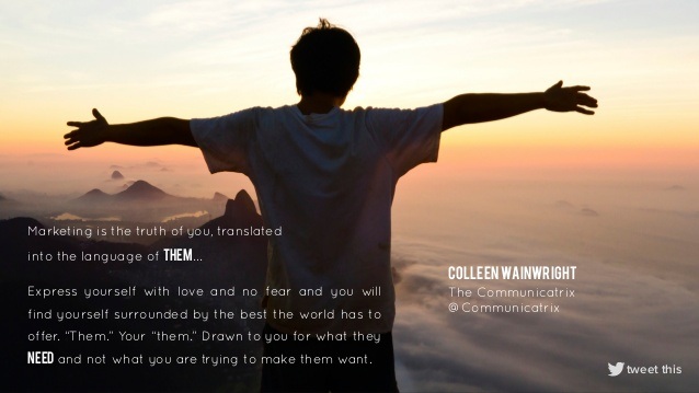
For a simple way to gain new food presentation ideas I highly recommend an account on Pinterest. Frankly, everyone else does the work for you, gathering creative photos showing ways to plate, decorate, cook, or present exciting culinary dishes, snacks, or baked goods. If I owned a bakery, I could probably make a million dollars just copying unique concepts people post. In this spirit I'd like to share a few great examples of folks going well beyond the norm to show food in it's best most alluring light.
Pinterest allows users to organize photos visually into various categories. As you'll see above I have segmented found photos into: Food Merchandising, Plating, Style, Feasts & Fetes, Culinary Action & Sizzle & Garnishing Ideas.
This allows me to easily reference an idea or to find some inspiration. Below are 10 Top Ideas I've found recently that embody innovation and uniqueness.
This allows me to easily reference an idea or to find some inspiration. Below are 10 Top Ideas I've found recently that embody innovation and uniqueness.
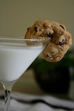
1. The extra touch visually and literally sweetens the menu. Note the untraditional glassware for milk!
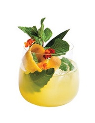
2. Extravagant Garnishes in Cocktails Drive the Visual and Sensory Experience.
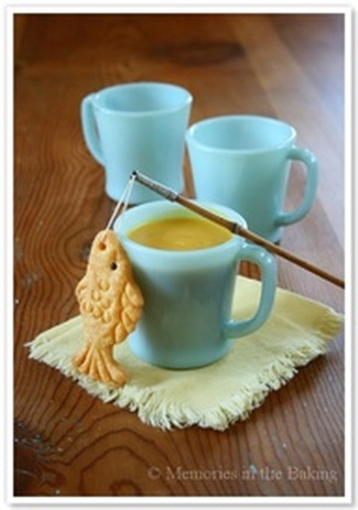
3. Props made from Food to "Tell the Story" and build fun interactive dining experiences.
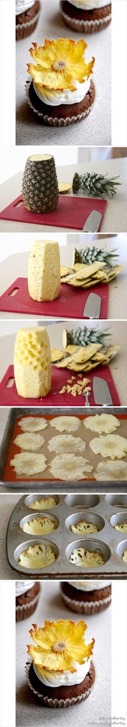
4. Creating "How-To-Bake/Make/Cook" Info/ Photo-graphics to demonstrate a concept.
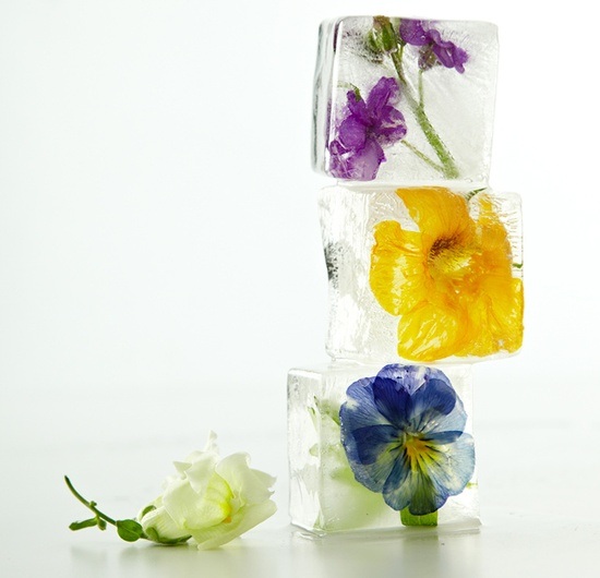
5. Floral Cubes: Edible Flowers encased in Ice as seen on Martha Stewart


 RSS Feed